Friday, December 01, 2006

The Economy

The "Big Picture" had an interesting perspective on the economy, which is provided as follows:

"On CNBC, the pundits are talking about how the most recent spate of data has put Goldilocks scenario in danger. I must admit to finding it amusing how much faith so many players had put into Goldilocks, a most unusual and unlikely scenario.

The latest data forces me to revise my 50% possibility of a recession in 2007/08 up to 60%. GDP for Q4 '06 is likely to be between 0.5% - 1.5% (or worse, if Holiday sales keep trending softer).

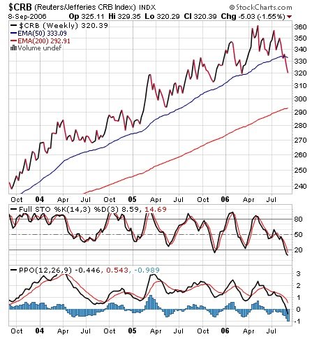
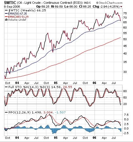
As far as the Fed, this data suggests that the jawboning about inflation will remain just that -- while we still expect the Fed to cut before 2007 comes to an end, the odds of a hike anytime soon have just dropped significantly.

Ism_1

Given the awful PMI and ISM data -- they both broke the key "50" demarcation -- one may be wondering how GDP data ended up getting revised upwards. The answer comes from the way GDP is constructed. But even more importantly, observe which
the components that increased the revised GDP -- these are symptomatic of a slowing economy:

Revised higher:

Government spending (0.05%)

Inventory Build (0.26%)

Imports (0.39%)

Revised lower:
Exports were revised 0.2% lower.

Consumption was revised 0.14% lower

Inventory build, government spending and imports, was responsible for virtually all of the 0.6% upward revision in GDP. Consumption, 70% of the US economy, is slowing.

Why are Businesses inventories increasing? Some pundits have claimed this is a bullish sign, an "anticipation of increased demand." I doubt this. We have seen recent CEO surveys which point to major negative sentiment amongst the usually cheery Execs; Durable Goods tumbled 8%, and Housing and Autos are likely already in a recession. My guess is that Just-in-time-inventory is easier to ramp than it is to slow down.

And while Reuters reported that "Business spending on inventories rose, increasing sharply to a $58 billion rate from the $50.7 billion earlier estimated." Inventories builds have increased at a faster than usual pace -- implying that this was (whoops!) unintentional.

Given the drop in both Durables and Capex, I am somewhat incredulous over Business spending being revised upward to show a 7.2% gain (versus 6.4% advance)."

Source: http://bigpicture.typepad.com

Saturday, November 25, 2006

Determination of Exchange Rates

The following chart illustrates the "plummeting $."


What is going on with the extreme weakness in the dollar (at a 19-month low)? What is causing the $USD to be so weak? From Chapter 21, which is entitled International Financial Management, we can make an inference as to the recent $USD weakness. Read pages 603-611 that provide insight for each of the following exchange rate determinates of the $USD: Income and taste, Changes in relative interest rates, Changes in relative price levels, Changes in fiscal and monetary policies, Changes in Balance of Payments, and Other Factors such as Oil Prices and SOX or SarbOX Act.

For Tuesday, October 28, be ready to discuss the causes for the $USD weakness.

Saturday, November 11, 2006

Yield Curve Says "Probable" 2007 Recession

John Mauldin notes:

"The yield curve became more inverted this week, with the negative differential between the 3-month and the 10-year at -49 basis points and a -76 basis point differential between the 10-year and the Feds fund rate. According to a Fed paper, that level of an inversion suggests there is now an over 40% probability of recession next year. This same model only predicted a 50% chance of recession in 2000, and as the paper authors acknowledge, the model probably understates risk in recent decades."

The yield curve and interest-rate data looks like this, which is from Bloomberg.com:

Yield_curve_mauldin

Source:

Honey, I Created A Bubble
John Mauldin
Investor Insight, November 10, 2006
http://www.frontlinethoughts.com/article.asp?id=mwo111006

Thursday, November 02, 2006

Free Cash Flow (FCF)

"Free Cash Flow (FCF)" represents the cash that a firm is able to generate after expending all the money to maintain/expand its assest base. In addition, investors like firms that produce lots of FCF; because it allows a firm to purse investment opportunities that enhance shareholders' wealth.

To calculate FCF, go to a firm's cash flow statement. There you will find the line item entitled "Total Cash Flow From Operating Activities." From this number, subtract the number from 'Capital Expenditure," which is found in the next section of the Cash Flow statement entitled "Investing Activites."

For your firm, calculate the FCF for the past three fiscal/calendar years and trend the data. What is the trend? Keep-in-mind that a negative FCF is not necessary bad. It could be the result of some large capital expenditures, which in itself could prove to be highly profitable.

Thursday, October 26, 2006

Halloween Indicator

The stock market is now entering what has historically been the strongest half of the year. The following chart, which is from "Chart of the Day," illustrates that investing in the S&P 500 from the last trading day in October, which is why it is referred to as the Halloween indicator, through the end of April accounted for the vast majority of S&P 500 gains since 1950. While there are some noteworthy periods in which the Halloween indicator didn't produce (i.e. 1973-74 & 2000-01), the overall performance is compelling. Therefore, on Tuesday, October 31, buy the S&P 500 Index and hold it until the last trading day of April, which is the 30. Place the proceeds in a "Money Market Account" until the last trading day in October 2007. Perfect formula for worry-free investing. And who said that investing is difficult. Trick or treat, anyone!


Wednesday, October 25, 2006

Saturday, October 21, 2006

History Lesson

"Stock prices have reached what looks like a permanently high plateau. I do not feel there will be soon if ever a 50 or 60 point break from present levels, such as they have predicted. I expect to see the stock market a good deal higher within a few months." - Dr. Irving Fisher, Professor of Economics at Yale University, one of the most important US economists of his day, speaking on October 17, 1929, a few weeks before the Great Crash.

Thursday, October 19, 2006

All Time High for the DJIA, or Is It?

The DJIA has moved over 12,000 in terms of dollars; but in terms of gold, it remains in a very well-defined "bear market." See the following chart.

May be we should be purchasing gold, like GLD or GDX, and not equity stocks. What do you think? Make your comments during the coming week.

Saturday, October 07, 2006

Goldilocks' Rally?

Core Personal Consumption Expenditures (PCE) inflation is the Fed's favorite gauge of measuring price inflation, which went to a high not seen in 13 years, well above the stated Fed comfort zone near the 2% ceiling. See the following chart that is from the Contrary Investor's report of October 3, 2006:


The reason that I present this chart is because the stock market is indeed anticipating that the Fed will soon be reducing its "Fed Funds" rate (January or March) with the market making a "new" this past week. In addition, the rate on the Ten Year TSY (4.75%) is below the Fed Funds rate (5.25%), which in the past has been an excellent harbinger of lower rates. Go to Bloomberg at http://www.bloomberg.com/markets/rates/index.html to see the current interest rate structures. Also, the decline in energy prices, especially oil and natural gas, along with the expectations that corporate earnings for the third quarter are going to be very robust have helped propel the market higher. But, the stock market has completely ignored the recent inflationary comments by several Federal Reserve members, which does not bode well for a cut in interest rates, along with signs that the economy is slowing, as discussed in last week's post.

On Tuesday, Fed Vice Chairperson Donald Kohn stated that he is more concerned about inflation than slowing economic growth because a recession is unlikely. On Thursday, Charles Plosser, Federal Reserve Chairperson of the Federal Reserve Bank of Philadelphia, stated that the Fed's very credibility was at stake when it came to keeping prices under control. He was clearly concerned that the core PCE inflation is above 2%, and he expressed the need to raise the Fed Funds rate, not lower it. Please remember that he, who has the gold, in this case the money, makes all the rules! And the Fed has all the money, therefore, it makes all the rules as it pertains to the financial markets and the economy. Therefore, don't count on the Fed reducing rates unless inflation, as measured by the PCE, comes down below 2%.

Monday, October 02, 2006

Risk-adjusted Rate of Return (Beta Analysis)

You just justed received your annual performance statement from your investment advisor. The statement indicates thaty your portfolio return for the past year was up 12%. In addition, you noticed within the statement that the S&P 500 rose 10%. Also, the statement gave the portfolio's beta, which means nothing to you, was 1.8. Further on, you read that the TSY Bill rate for the time period was 4.75%. To your dismay, the statement did not provide any further explanation. Therefore, you decide to call your investment advisor for clarification on what this all means. As an investment advisor, what is your response to your client? As the client, are your happy with the performance of the portfolio?

Friday, September 29, 2006

Quote of the Week

The market can stay irrational longer than you can stay solvent.
-John Maynard Keynes (1883 - 1946)

Wednesday, September 27, 2006

Be Forewarded!

According to ContraryInvestor, every time over the last fifty (50) years that the year over year rate of change in the Leading Economic Indicators (LEI) dropped below 0.5%, either an outright "recession or a meaningful economic slowdown" has occurred. Wow! That is an excellent track record. By the way, the August 2006 LEI rate of change was 0.51%. I will definitely monitor the year over year rate of change for the LEI. The following chart, which is from the ContraryInvestor, illustrates the LEI for 2006 through August.

If one combines the track record of the LEI with the current negative to flat Yield Curve, a 2007 slowdown of significance definitely looms on the economic horizon. The probability will increase if the September 2006 LEI comes in under 0.50%, and the Yield Curve remains flat to negative.

Cost of Capital

The "Problem-set Solutions" are now posted for Chapter 11 on the course website.

Our discussion yesterday pertained to historical cost of capital computations. If a company was to issue new preferred and/or common stock, one would have to incorporate a fee that the company has to pay to the investment banker for selling the "new" security. This fee is referred to as the "floatation cost." Since it is a cost, the firm's cost of capital for preferred and/or common will increase. For our equation for "cost of NEW common stock equity," the refinement to our basic equation is as follows: [(EXPECTED DIVIDEND/(PRICE-FLOATATION COST)] + GROWTH RATE OF DIVIDEND. If you were calculating the "Cost of New Preferred," you would make the same adjustment by inserting the floatation cost into the equation.

Friday, September 22, 2006

WTIC (Oil Light Crude) Revisited

I thought it would be a good time to revisit the price of oil from the "post" of September 9. Since then, oil has declined approximately 9% to close Friday at $60.55. My analysis, at that time, projected that the price of oil would decline to its 200-week EMA, which is $51.50; and the price of gasoline at the pumps would be approximately $1.70. Has that analysis changed? Let's look at the following chart, which is WTIC as of Friday, September 22, before I give you my updated analysis.

First, look at the top portion of the chart that is entitled "Full Sto," which is a Stochastic Oscillator. I want to draw you attention to the "arrows" on the oscillator. Notice that the level of the oscillator at each arrow reads "20 or lower." Subsequently, the price of oil rose and in some cases, significantly. Second, look at the bottom portion of the chart that is entitled "CCI," which is the Commodity Channel Index. As before, isolate on the "arrows" and notice that the levels were "-100 to -200" and the subsequent price rise. The Stochastic Oscillator and Commodity Channel Index measure short-term levels of being "overbought or oversold." Therefore, given the current, extremely, oversold readings, oil prices should move higher in the near term. Probably, oil could rise back to its 50-week EMA and the downward sloping resistance line, which is $66 or about 7%. If the $66 level is not significantly penetrated, oil should continue its price decline to the $51 level. Once again, this analysis is based on current world conditions. If the "geo-political" environment deteriorates, all "bets" are off. In the meantime, enjoy these gasoline prices. By the way, I paid $1.99 today to fill by Yamaha Waverunner.

For Tuesday, apply the Stochastic Oscillator and Commodity Channel Index to your stock and indicate if the stock is "overbought or oversold."

Thursday, September 21, 2006

Technical Analysis

Would you recommend purchasing or selling the following company? Email me your response prior to class tomorrow.


Wednesday, September 20, 2006

Amaranth

Who is Brian Hunter? What is his claim to fame? Read Tuesday's WSJ, Section A, Column 5 for the answer. Also, read Wednesday's WSJ, Section C1.

Monday, September 18, 2006

Williams%R

Developed by Larry Williams, Williams %R is a momentum indicator. It is especially popular for measuring overbought and oversold levels. The scale ranges from 0 to -100 with readings from 0 to -20 considered overbought, and readings from -80 to -100 considered oversold.

Using the EFA chart previously posted, how would you incorporate the "Williams%R and MACD" into generating buy and sell sigals? Be prepared to discuss the "Williams%R and MACD" concepts on Tuesday.

MACD Formula

According to StockCharts, the most popular MACD formula, which is the one that we will use, is the difference between a security's 26-day and 12-day exponential moving averages. This is the formula that is used in many popular technical analysis programs and quoted in most technical analysis books on the subject. For our purposes, the traditional 12/26 MACD will be used for explanations.

Of the two moving averages that make up MACD, the 12-day EMA is the faster and the 26-day EMA is the slower. Closing prices are used to form the moving averages. Usually, a 9-day EMA of MACD is plotted along side to act as a trigger line. A bullish crossover occurs when MACD moves above its 9-day EMA, and a bearish crossover occurs when MACD moves below its 9-day EMA. The EFA chart below shows the 12-day EMA (thin blue line) with the 26-day EMA (thin red line) overlaid the price plot. The EFA chart below shows the MACD in the box below as the thick black line and its 9-day EMA is the thin blue line. The histogram represents the difference between MACD and its 9-day EMA. The histogram is positive when MACD is above its 9-day EMA and negative when MACD is below its 9-day EMA.

Based on the MACD formula, would you be a purchaser of EFA? Explain.

The URL for a full discussion on the MACD formula can be found at http://stockcharts.com/education/IndicatorAnalysis/indic_MACD1.html.

Monday, September 11, 2006

Charts

Take a look at the following link to see how nasty today's price action in the energy and gold areas really was: http://stockcharts.com/def/servlet/Favorites.CServlet?obj=ID530404 .

Commodity Research Bureau Index, Crude Oil, and Gold Plummet

If you visited the blog over the weekend (How Low is Low?), you know that penetrating major support areas did not bode well for oil and gold. Either though I did not show you the chart on gold, its price was behaving just like the CRB Index andcrude oil. Today, the CRB Index was down 6.66 or (2.08%), crude oil was down $.64 or (.97%), and gold dropped $20 or (3.2%).

With today's price action, these markets are in the most "oversold" since last year. Therefore, expect a strong rally back up to the 50-week EMA as shorts cover to lock-in profits. Overall, I am still expecting oil to sell in the low $50's before this decline is over.

Make sure you visit the course Web page, because I have some exercises for you to do for tomorrow's class.

Saturday, September 09, 2006

How Low is Low?

Gas is currently selling for $2.19 a gallon and headed under $2. Wow! It was just a short-time ago that eveyone was thinking that we would be paying well over $3 a gallon. Does this mean that the five-year energy bull market is over? If the energy bull market is over, what about the other resource areas that have experienced major bull moves, like gold, silver, copper, etc.? In order to address the above questions, let's look at the following chart of the Commodity Research Bureau (CRB) Index, which is comprised of twenty-two (22) sensitive basic commodities whose markets are presumed to be among the first to be influenced by changes in economic conditions.


CRB Index has penetrated its 50-week EMA average, which does signal an end to its five-year major trend. However, since the 50-week EMA is above the 200-week EMA, the commodity bull market is still intact. What we can expect is a "correction" down to the 200-week EMA, which is currently about 300. Ok, what does this chart have to do with the price of oil? Everything. Take a look at the following $WTIC chart, which is the "Light Crude Oil."


The price ($67.15) has penetrated its 50-week EMA ($67.39). $WTIC is following the price action of $CRB. Like the $CRB, $WTIC is still in a major bull market. Therefore, a reasonable downside price objective for oil is at the 200-week EMA, which is $51. By the way, that should equate to about $1.70 at the pump and still leave the major oil bull market intact.

You may have noticed that the two charts include some additional information (PPO and Full Sto) besides the "price." We will discuss these market indicators next week. In the meantime, enjoy these gas prices!

Thursday, September 07, 2006

Quote of the Week

"That men do not learn very much from the lessons of history is the most important of all the lessons of history." -- Aldous Huxley

Sunday, September 03, 2006

Turn-out the Lights

Don Meredith, ex-Dallas Cowboy quarterback and ex-Monday Night Football's Commentator,would say the above phrase after a football team had no chance to win! In regard to the housing market, stock market, and PCE component of GDP, I would refine the statement as follows: "Turn-out the Lights, or, at Least, Let the Reader Beware for 2007!

The following chart that relates the National Association Homebuilders Index to the S&P 500 Index is from David Rosenberg, North American economist for Merrill Lynch.

Quoting Mr. Rosenberg: "The above chart is rather intriging in that the NAHB Index leads the S&P 500 by twelve (12) months and with a near 80% correlation. This relationship has actually strengthened, owing to the growing influence that the real estated market has exerted on the overall economic and financial landscape over the past five years. In fact, we can trace almost 2% points of the 3.5% average annual rate in real GDP over the past five years."

Lon Witter, writing in the August 13 edition of Barron's, argues that there has not been a housing bubble but a lending bubble. He provides the following data to back-up his thesis:
1. 32.6% of new mortgages and home equity loans in 2005 were interest only, up from 0.6% in 2000.
2. 43% of first-time home buyers in 2005 put no money down.
3. 15.2% of 2005 buyers owe at least 10% more than their home is worth.
10% of all home owners with mortgages have no equity in their homes.
$2.7 trillion dollars in loans will adjust ot higher rats in 2006 and 2007.

Once again, let the reader beware. Think the above information may foreshadow trouble for financial stocks and the overall equity market? However, it gets more interesting, see the following chart, which is from ContraryInvestor.Com, that relates the NAHB Index to Real Personal Expenditure Consumption (PCE):


The above chart links housing to consumer spending. As you can see, at least in the past, there has been a very high degree of correlation between the NAHB Index and the direction of real PCE. Why is this relationship relevant? In regard to GDP, PCE comprises more than 70% of overall economic activity. If indeed this relationship continues, we may see real PCE in the negative column, which, of course, would result in very weak GDP numbers going forward from here.

We definitely monitor the NAHB Index and real PCE throughout the semester.

Wednesday, August 30, 2006

2006 Year End Rally: Is Perception and Reality the Same?

Scenario for rally in financial assets is as follows:
1. Pause in monetary tightening as indicted by the Fed Funds rate
2. Moderation of inflation as measured by PPI “Core Finished Goods and Core Intermediate”
3. Lower interest rates in the 2+ year maturity range. (Usually if the 2-Year TSY is below the Fed Funds rate, it is a precursor for lower rates.)

What is the evidential data for the above scenario being successful? Let's see. Number One is a reality. The "Fed" left the fed funds rate at 5.25% at its last meeting. Number Two is 50% reality. The PPI "Core Finished Goods" came in at 1.3% (August 2005 to July 2006). Source is the Federal Reserve Bank of St. Louis at the following URL: : http://research.stlouisfed.org/fred2/series/PPILFE?&cid=31. This is the good news, but, when one looks at PPI "Core Intermediate Goods," the news is not so good. Year-over-year the rate came in at 8.3%. Therefore, inflation is still in the pipeline. See the following link: http://research.stlouisfed.org/fred2/series/PPIITM?&cid=31. Number Three has not been completely resolved. Yes, the 2-Year TSY rate is less that the Fed Funds Rate; however, from a technical perspective, the 2-Year U.S. Teasury Yield Chart might be indicating that higher rates are ahead of us. See the chart, which is from StockCharts.com.

Now, what is your recommendation for the year-end rally?


Saturday, August 26, 2006

St. Louis Fed U.S. Dollar or U.S. Dollar Index

Two thirds of the $USD Index is keyed off the Euro currencies. The $USD Index does not contain any relative currency weighting at all to key trading partners such as Mexico and many Asian counties (Korea, Thailand, Taiwan, Singapore, Hong Kong, etc.). The St. Louis Fed does calculate an alternative trade weighted dollar index that is much more representative of the true U.S. global trade. A declining $ is a “forward inflationary measure.”

Go to the following link and indicate what the chart is indicating about upcoming inflationary pressures? Link is as follows: http://research.stlouisfed.org/fred2/series/TWEXB?&cid=15.

Monday, August 21, 2006

Market Sites

Yahoo has a good financial site at http://finance.yahoo.com. In addition, CNN has a good money site at http://money.cnn.com. One of the best overall financial/news sites is Bloomberg, which is at http://www.bloomberg.com. Check out these sites.

Use Morningstar's site to learn about ETFs. The site is located at http://www.morningstar.com/Cover/ETF.html. Find an ETF that can be used as a Gold proxy.

Wednesday, July 05, 2006

GLD, an ETS, closed Monday at $62.18. Price "set-up" is above the 3% risk factor. Wait for pull-back to purchase.

Thursday, June 22, 2006

Where do we go from here?

Check out Jack Chan's blog. Throughout the semester, we will use this "blog" as our benchmark to based our overall performance.